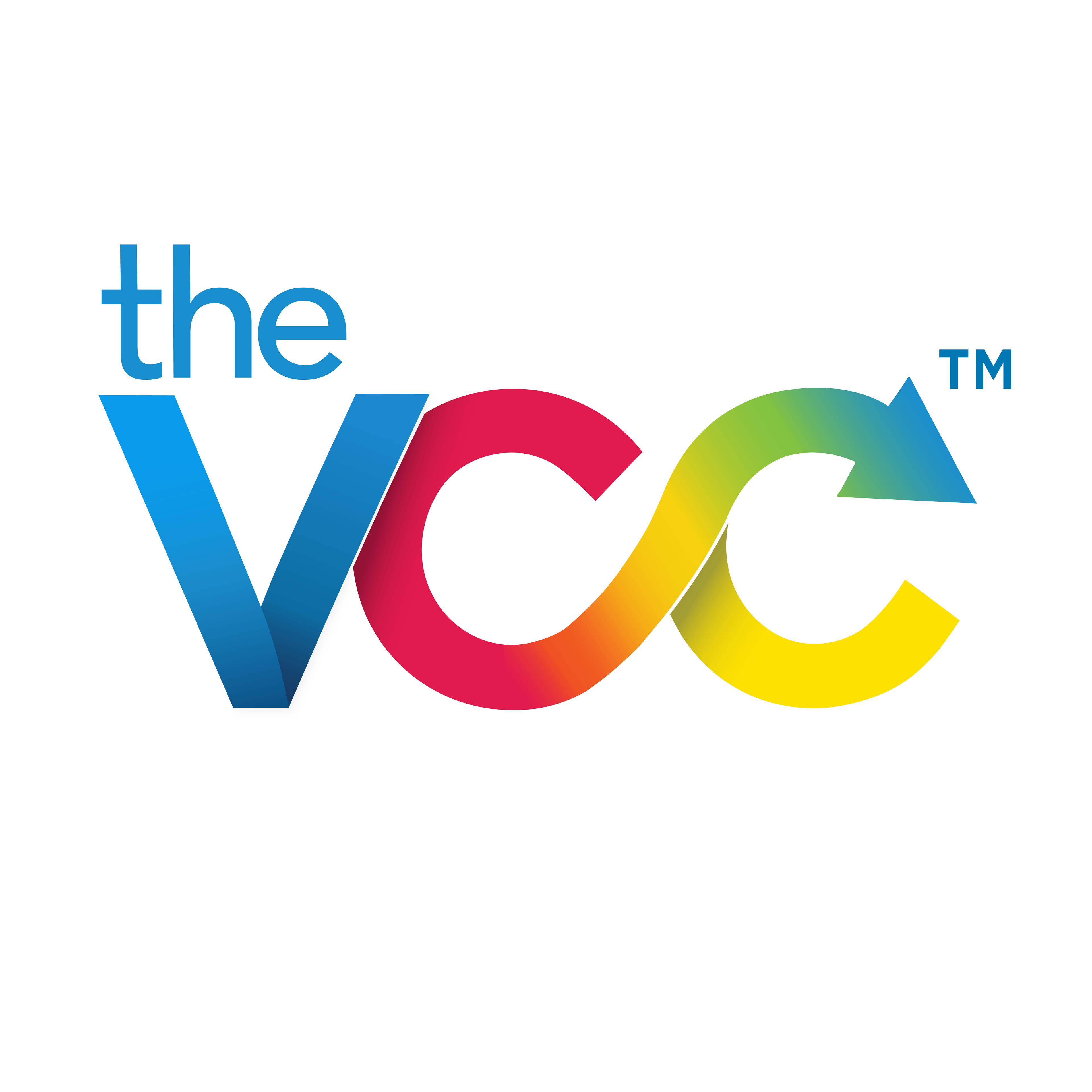
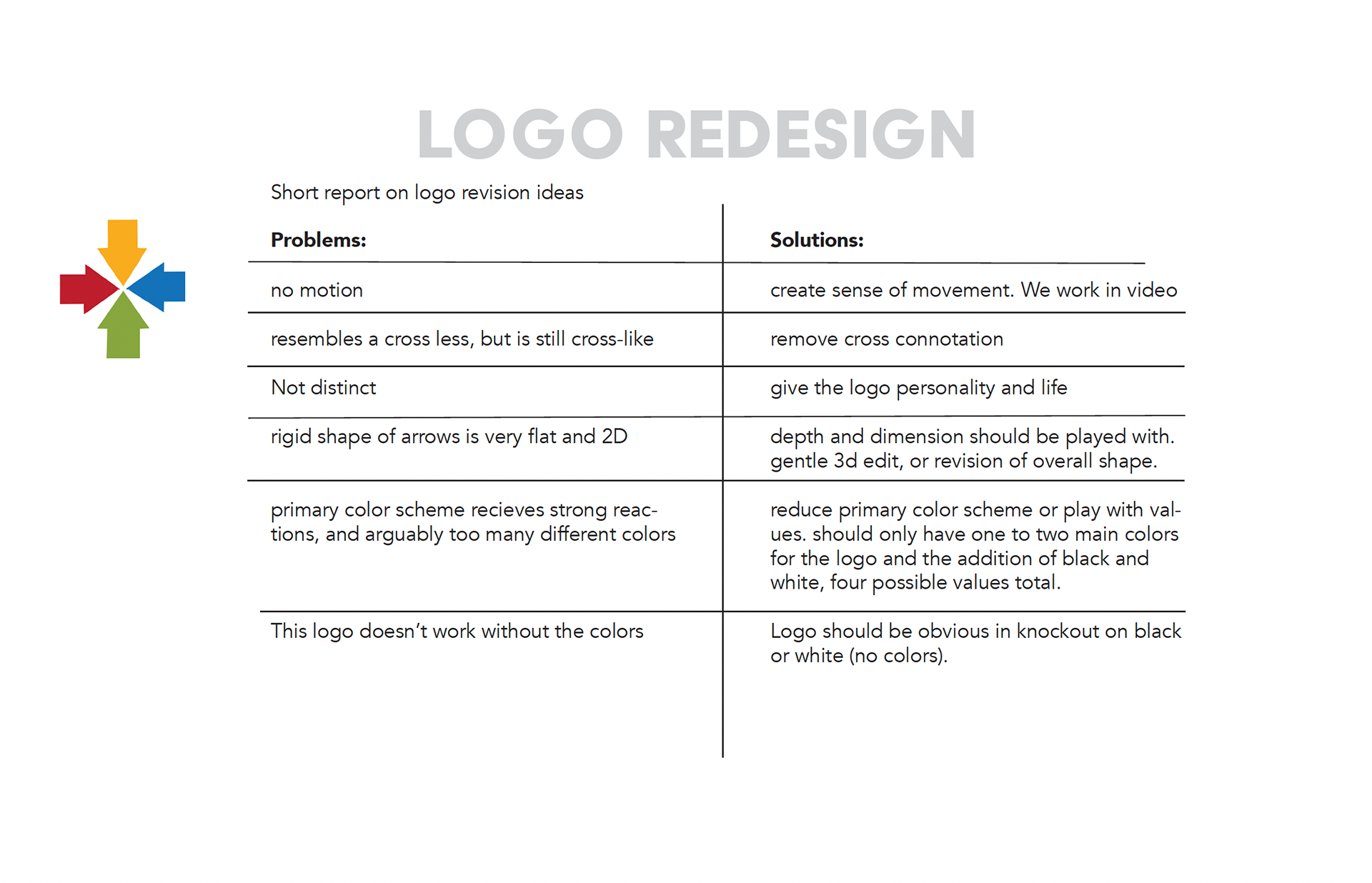
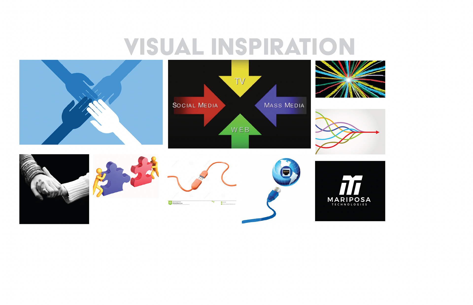
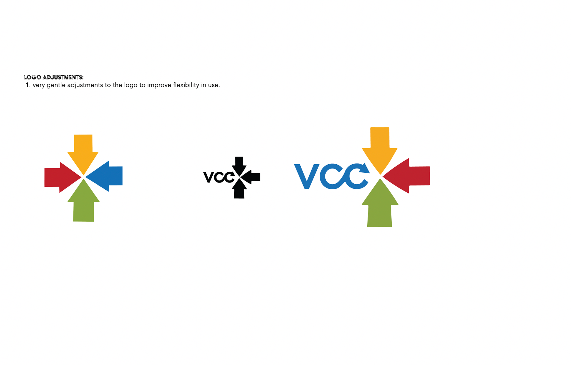
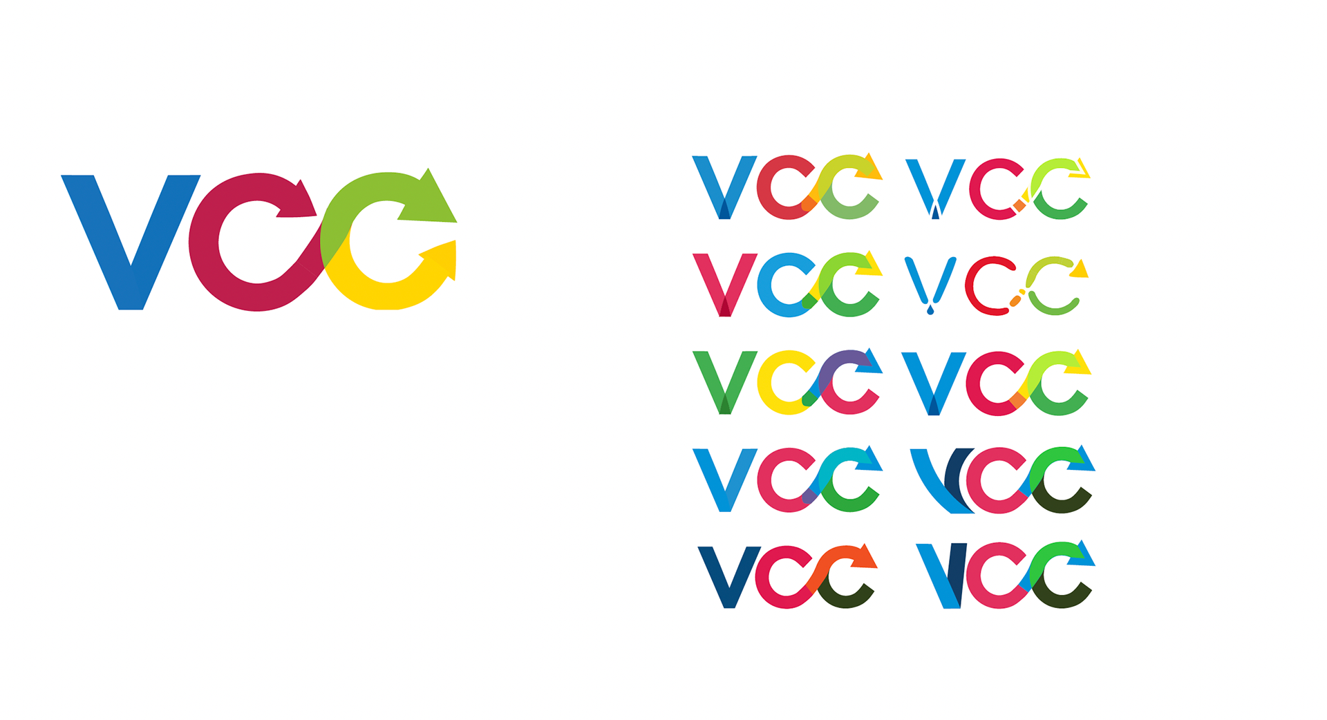
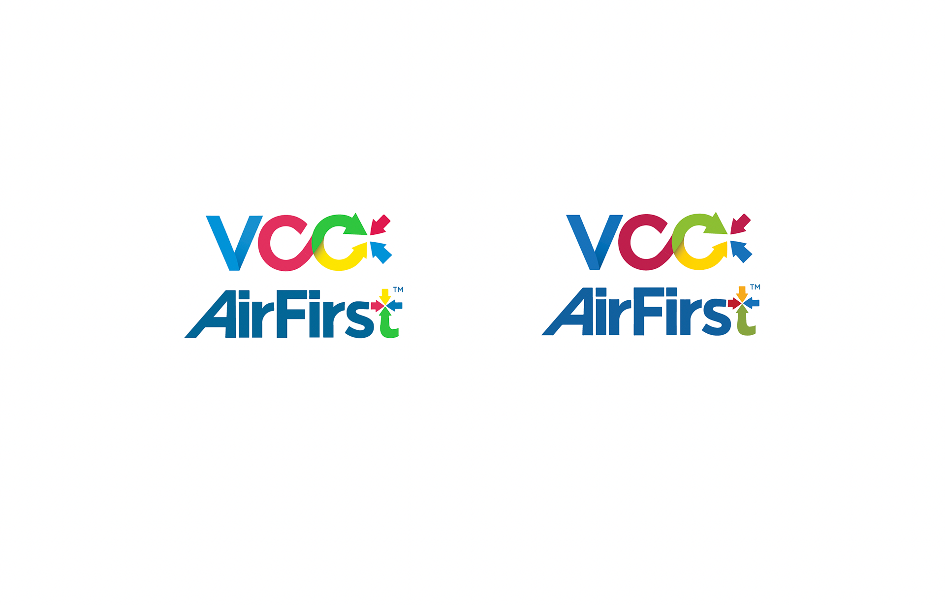
It was important to the members of the company and founders that the colors, and feelings from the original arrow logo made of a vibrant red, yellow, blue, and green were still present in a redesigned logo. These colors and the concept of merging, motion, and being at the center of a touchpoint for many mass communication platforms. The 4 original arrows and colors represented social media, web, television and mass media, and the VCC was where they all were able to converge and adapt.

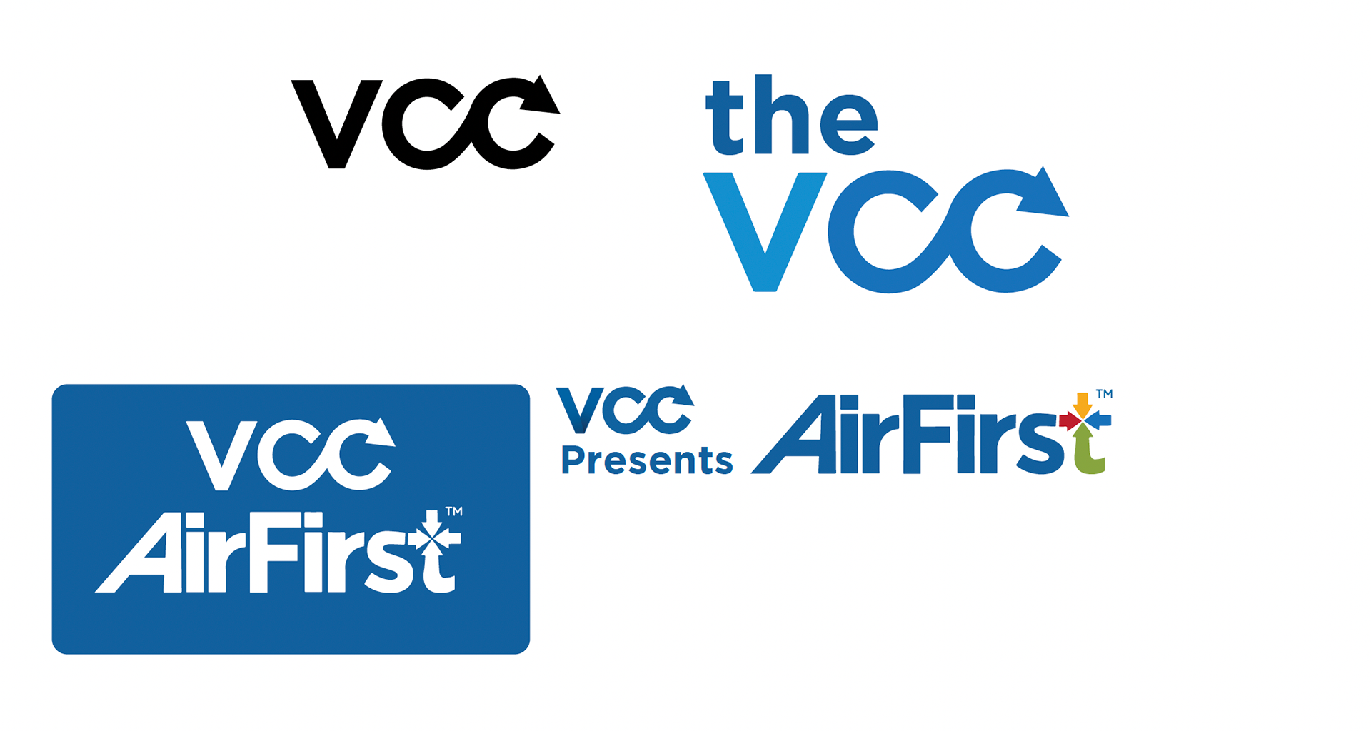
Previously, no fonts have been used and no style guide set, generally using a san-serif for all branding and products
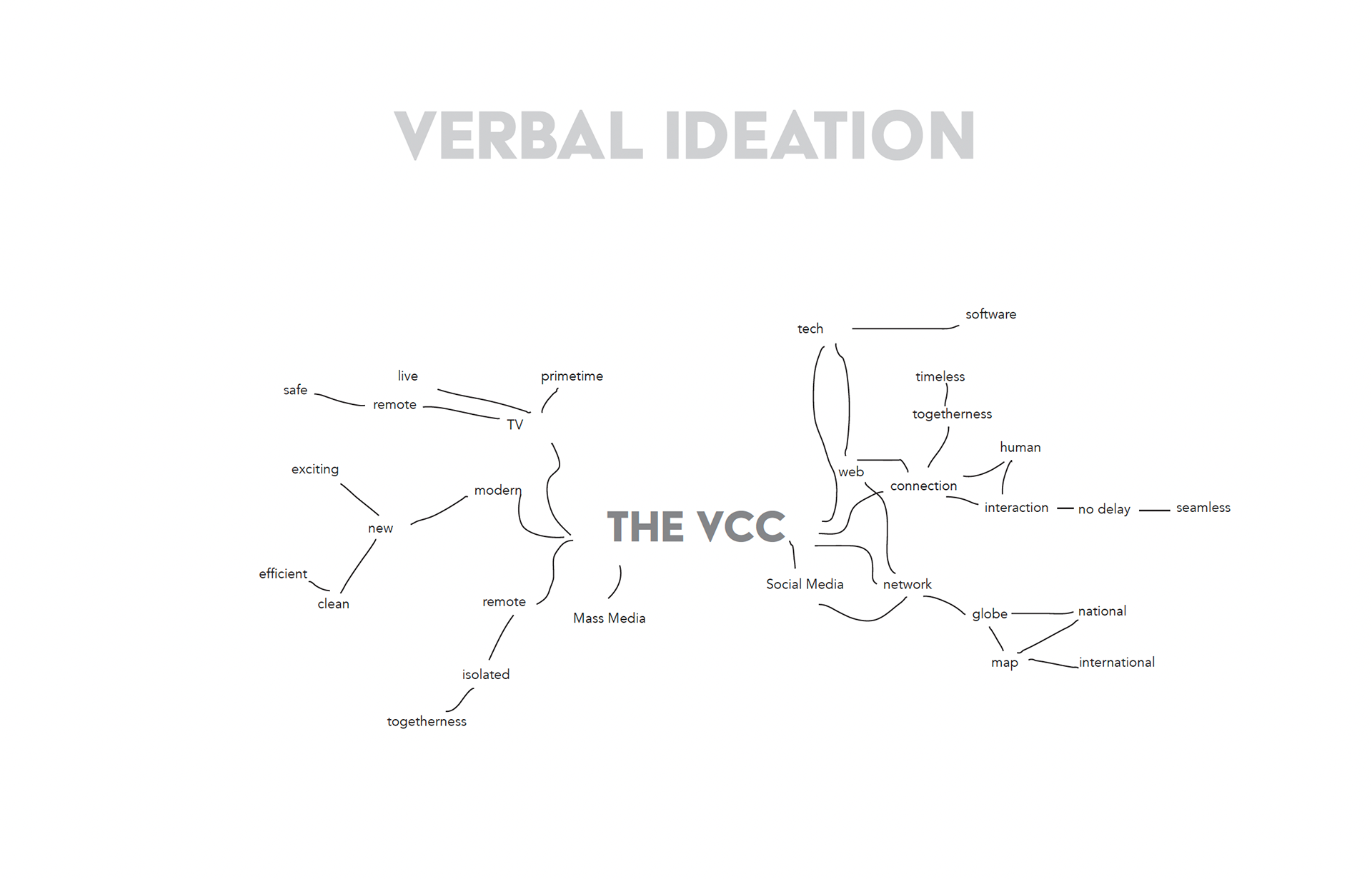
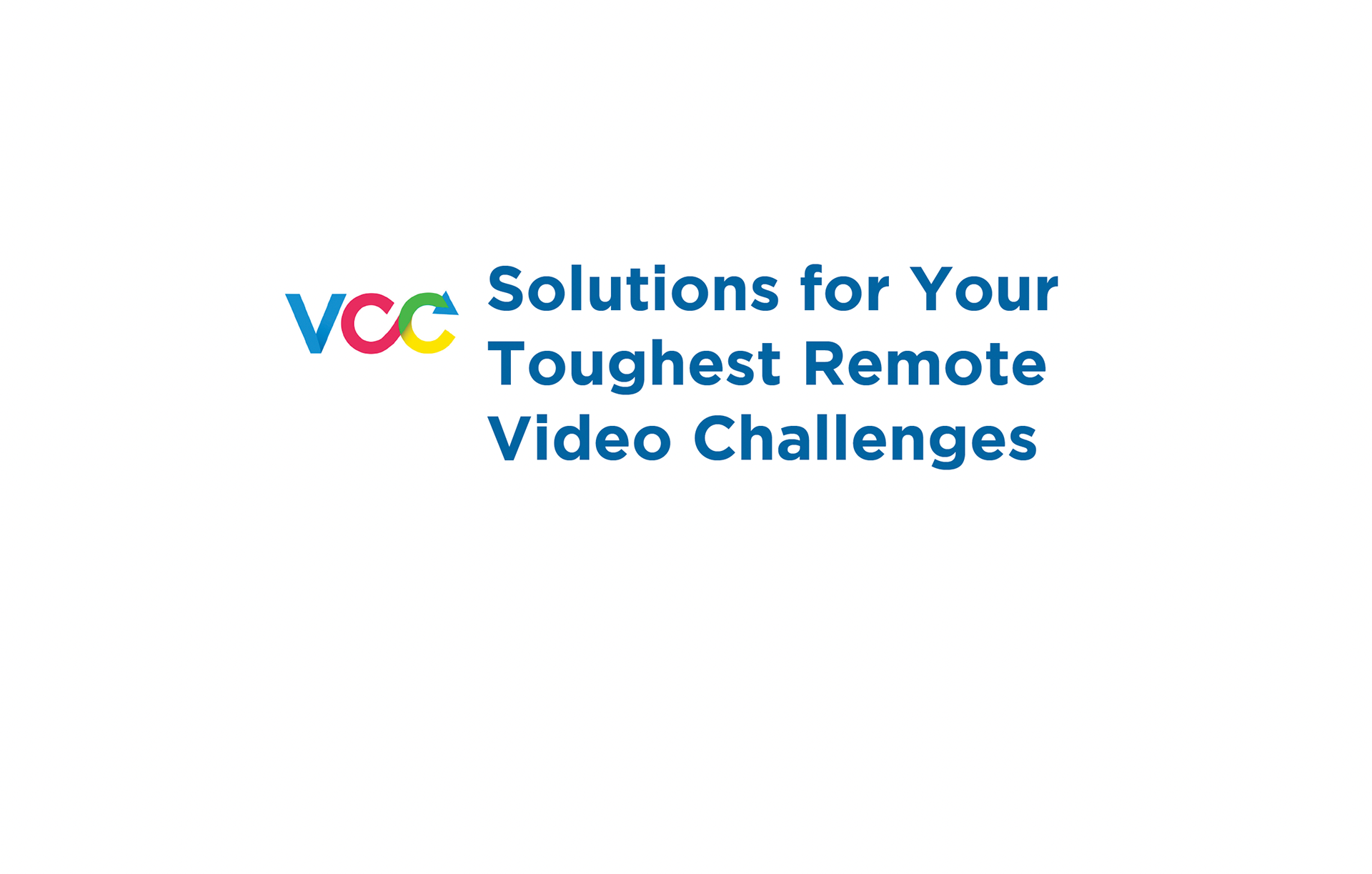
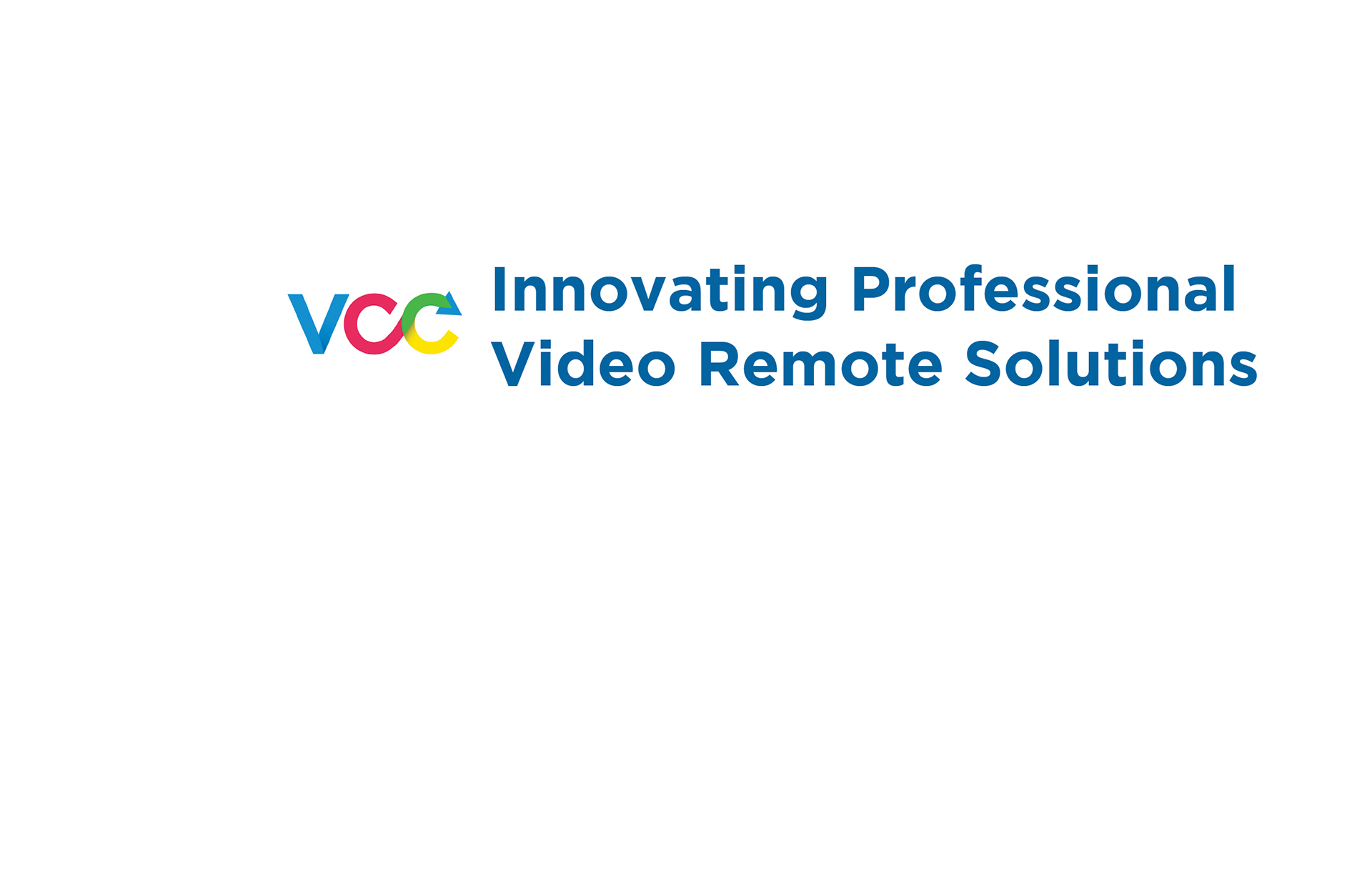
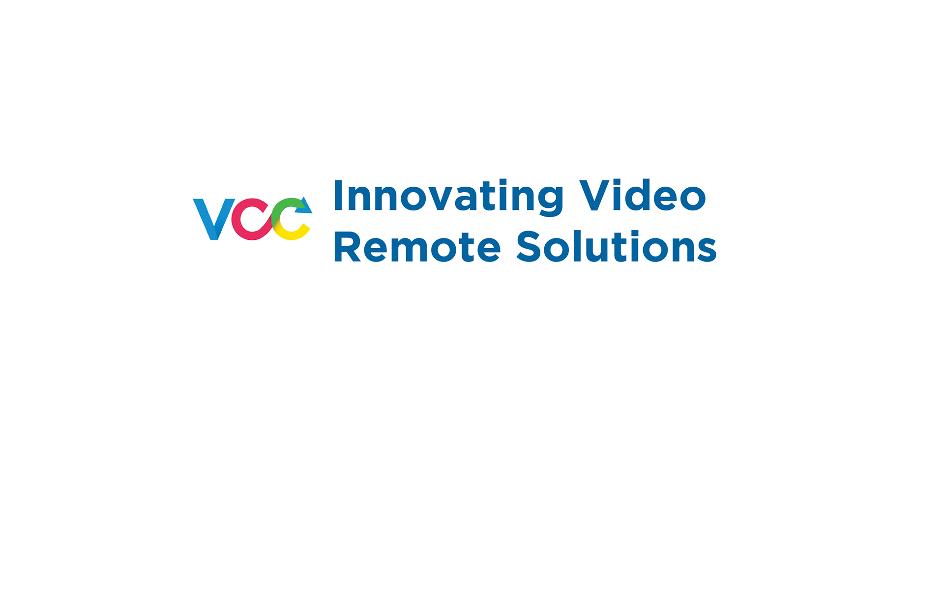
In my experience, this type of workflow and presentation is important to showcase to clients. This is helpful to show and highlight the thought process going into the work you are presenting, and help give your suggestion credibility.
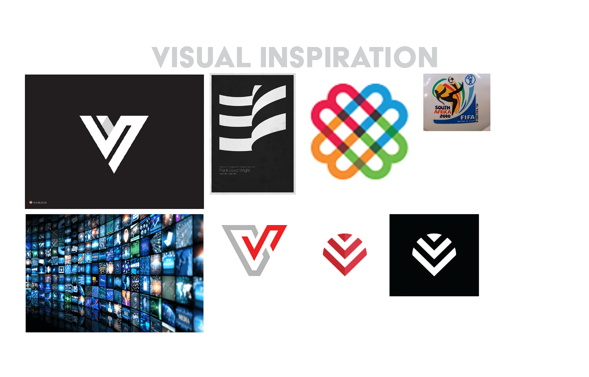
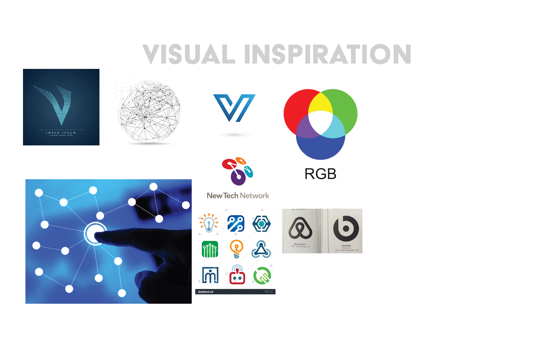
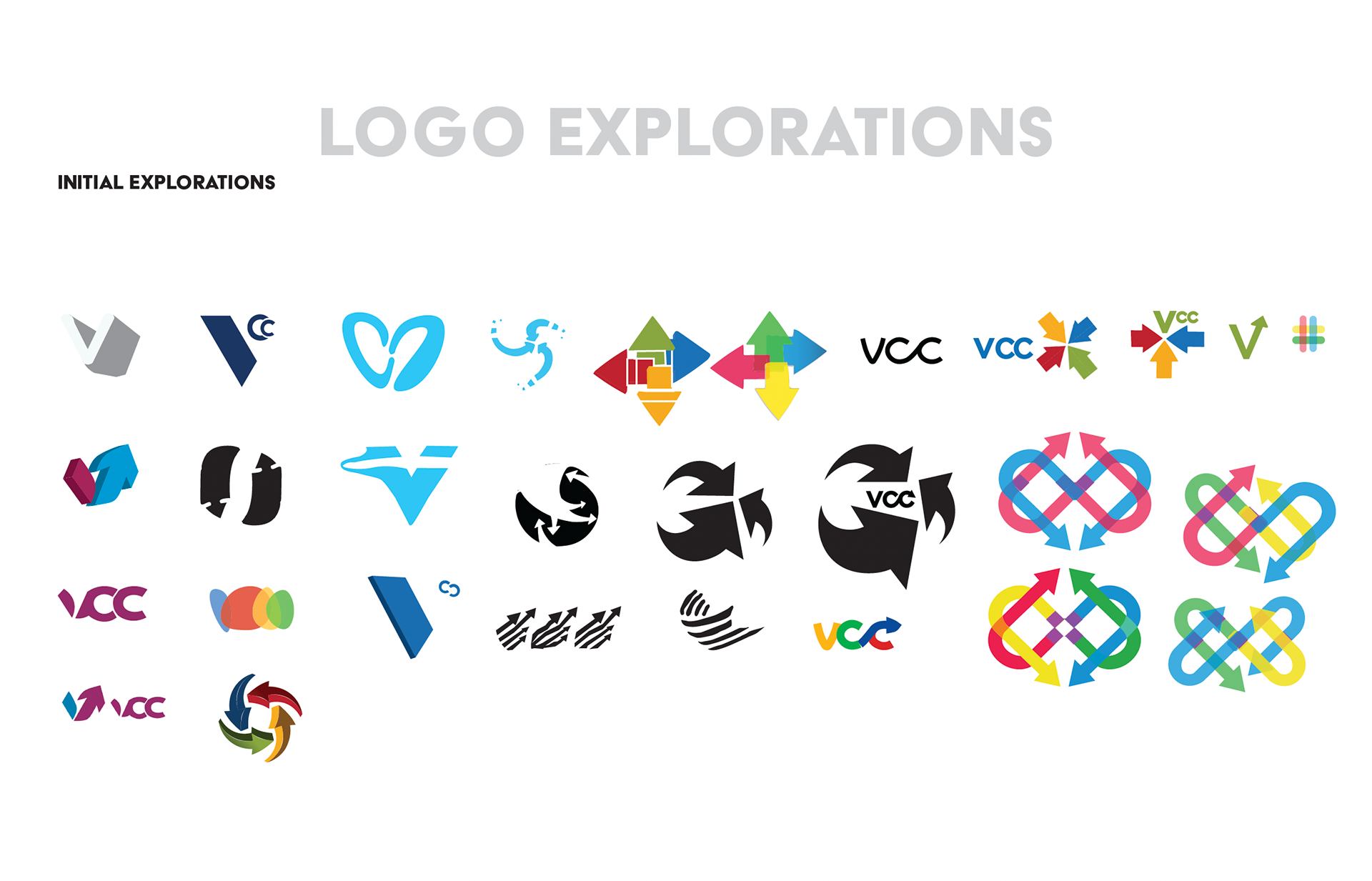
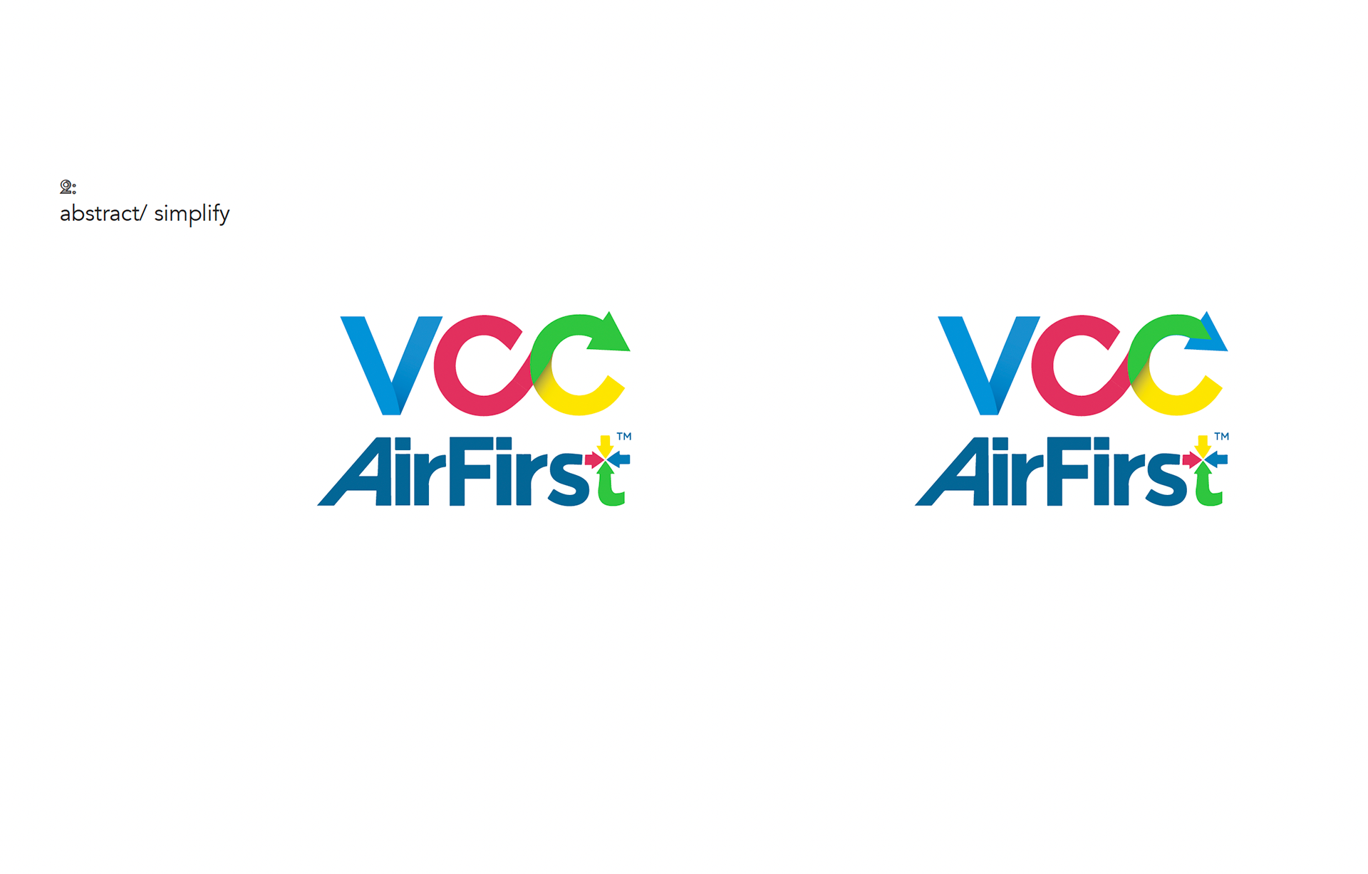
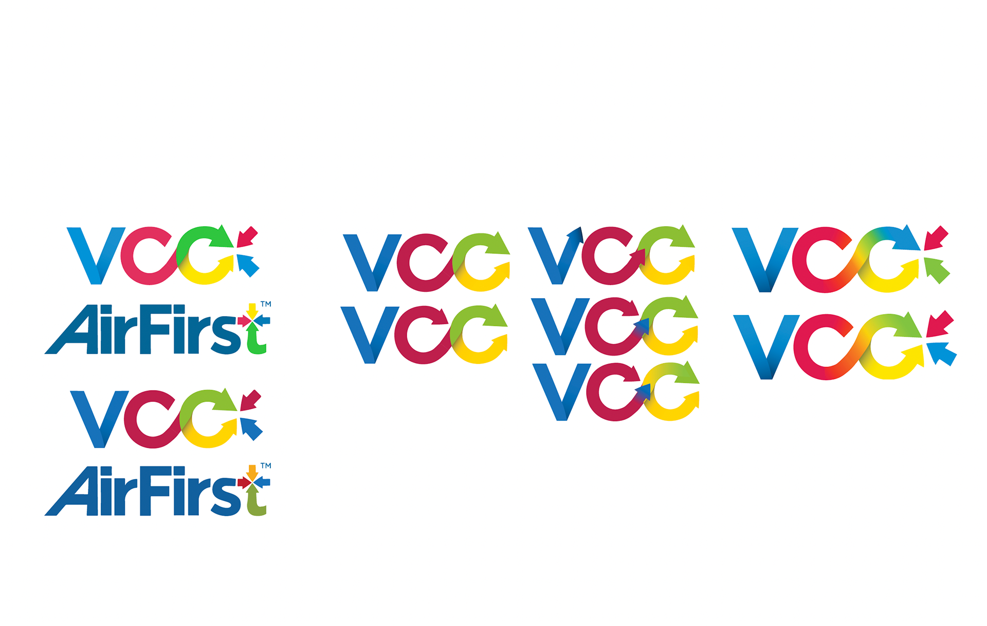
It became clear at this stage that a simpler logo would serve best, but all avenues requested were explored.
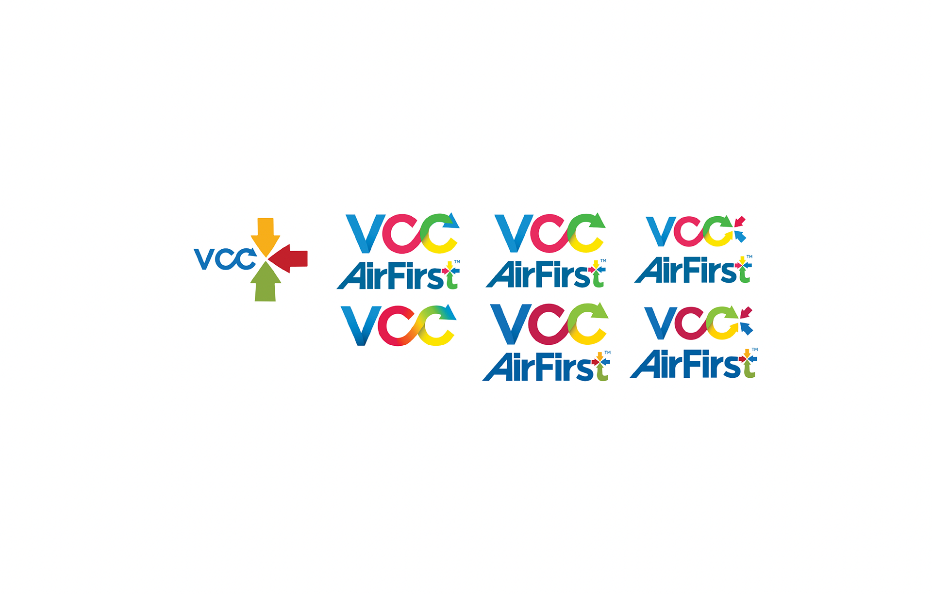


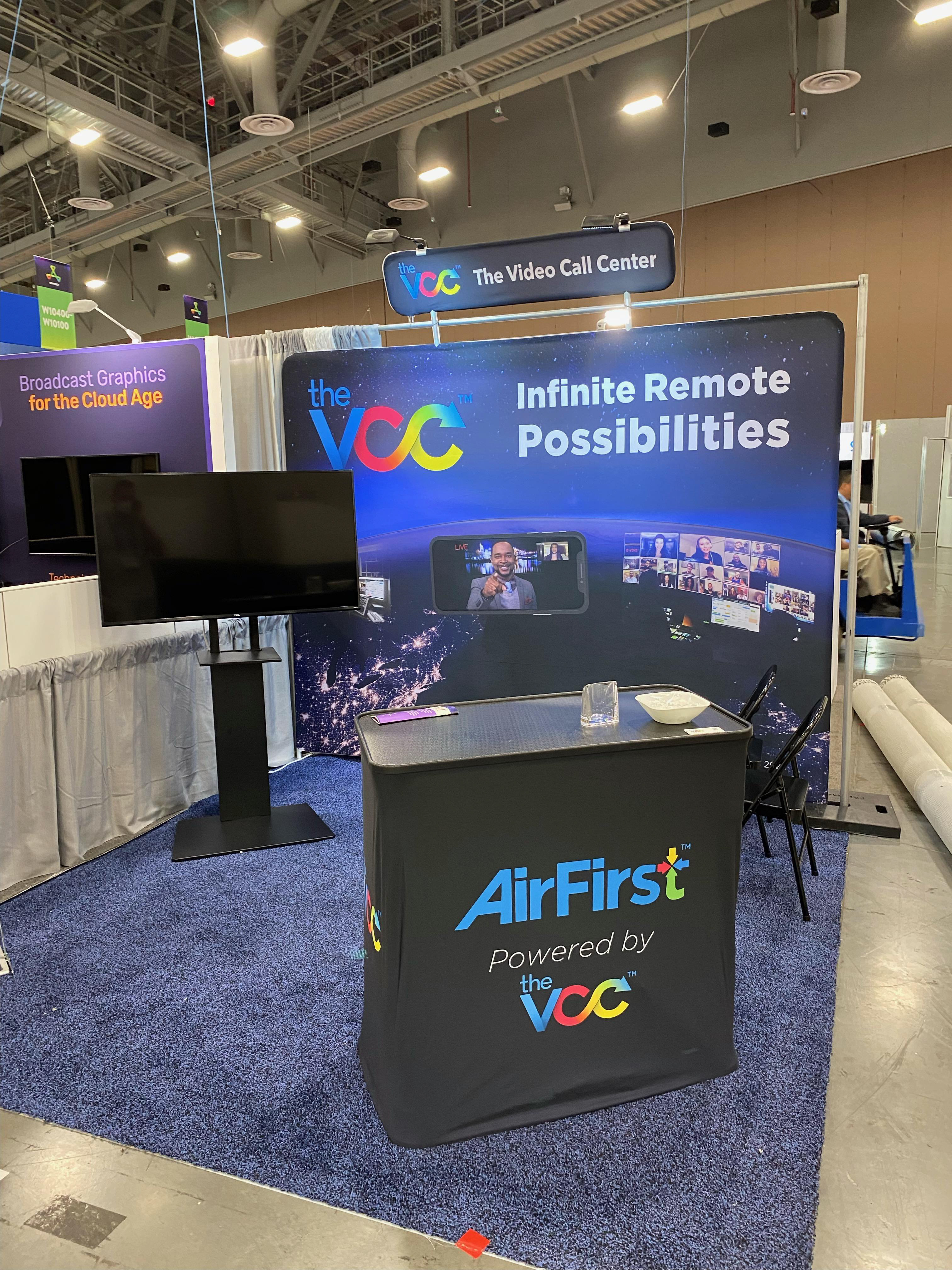
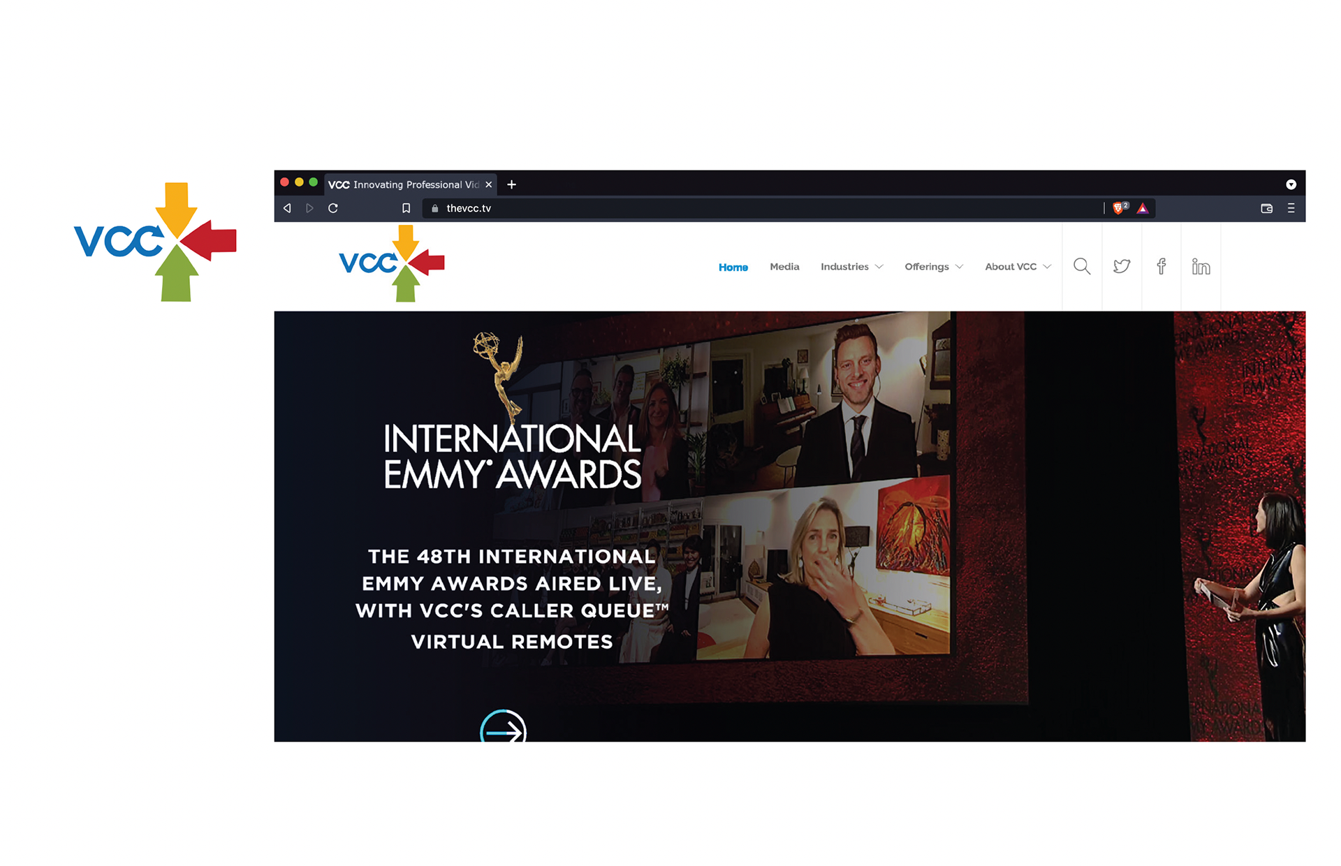
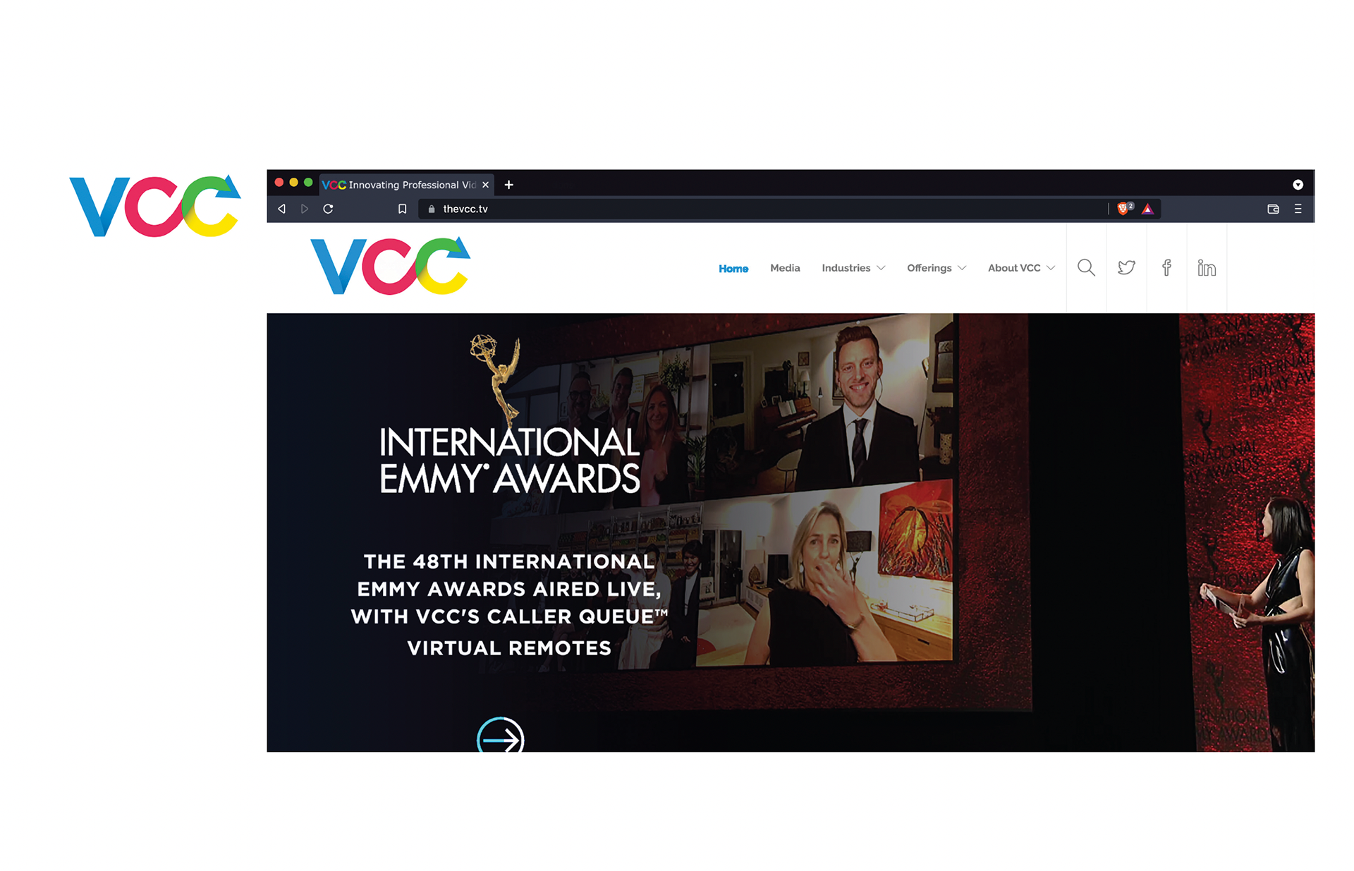
The Final Logo for the company on display at NAB 2022 in April, and branding for the principal product